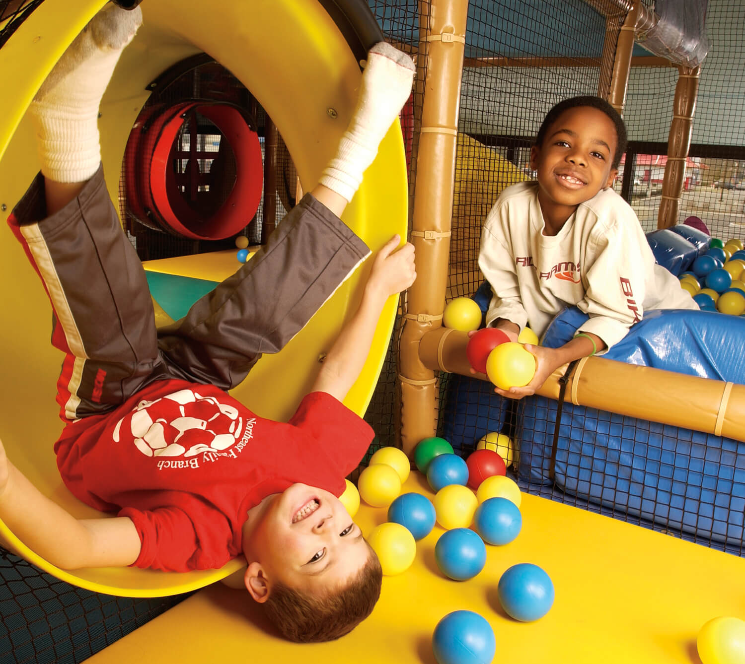
The Playground is an enormous, multi-level indoor play place for children that was entering a very crowded market. Its corporate identity needed to reflect what separated it from the competition: the importance of creativity in play.
The Playground was founded on the idea that there is value in children creating their own fun. All kids needed were the raw materials: dress up stages, puppet theaters, blocks, climbing walls, and art spaces.
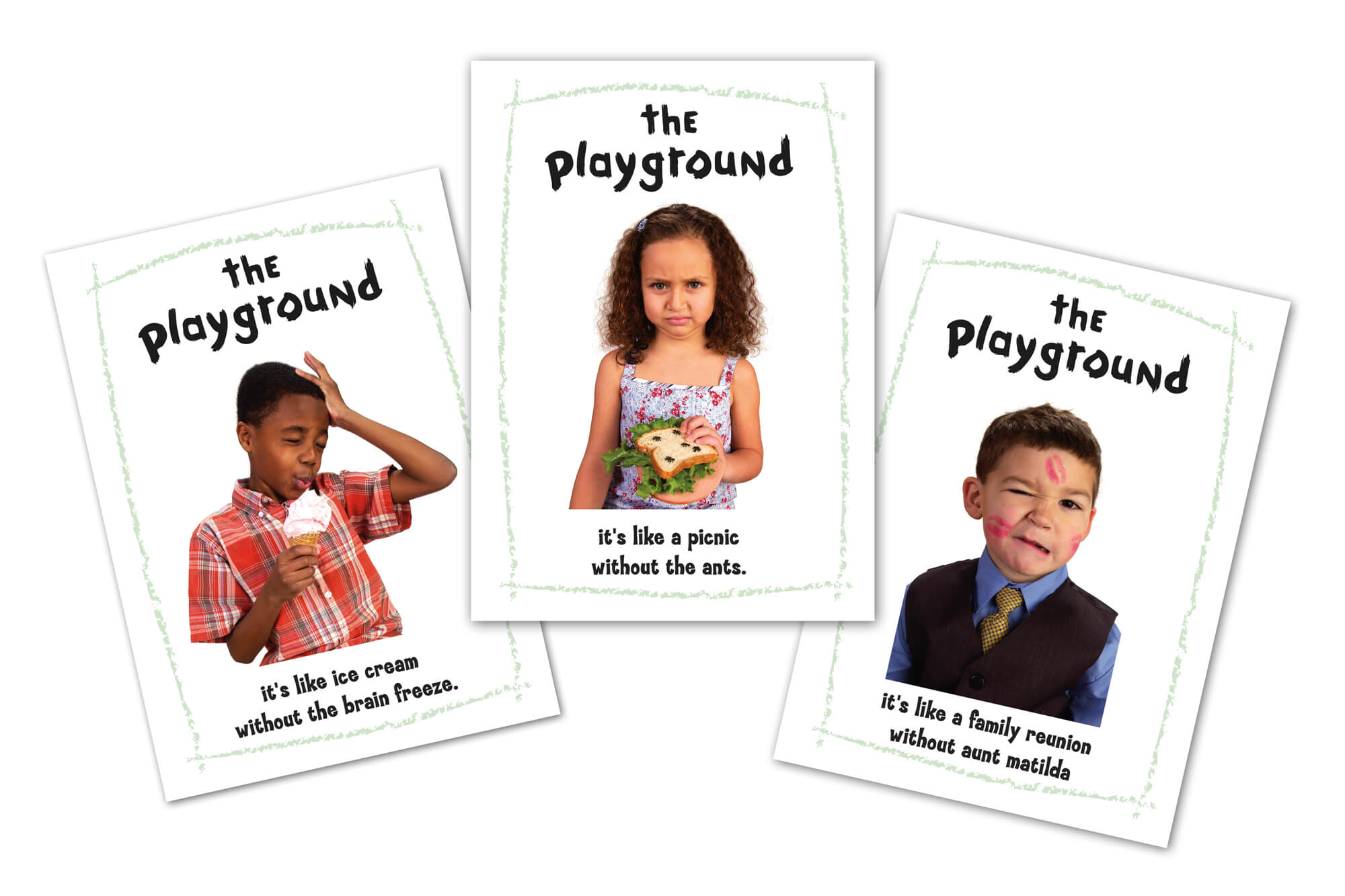
Summa Creative was asked to build the brand that would separate the Playground from the competition. Instead of creating a polished, over-produced image of childhood from an adult’s perspective, we wanted the entire identity to reflect the creation of a child.
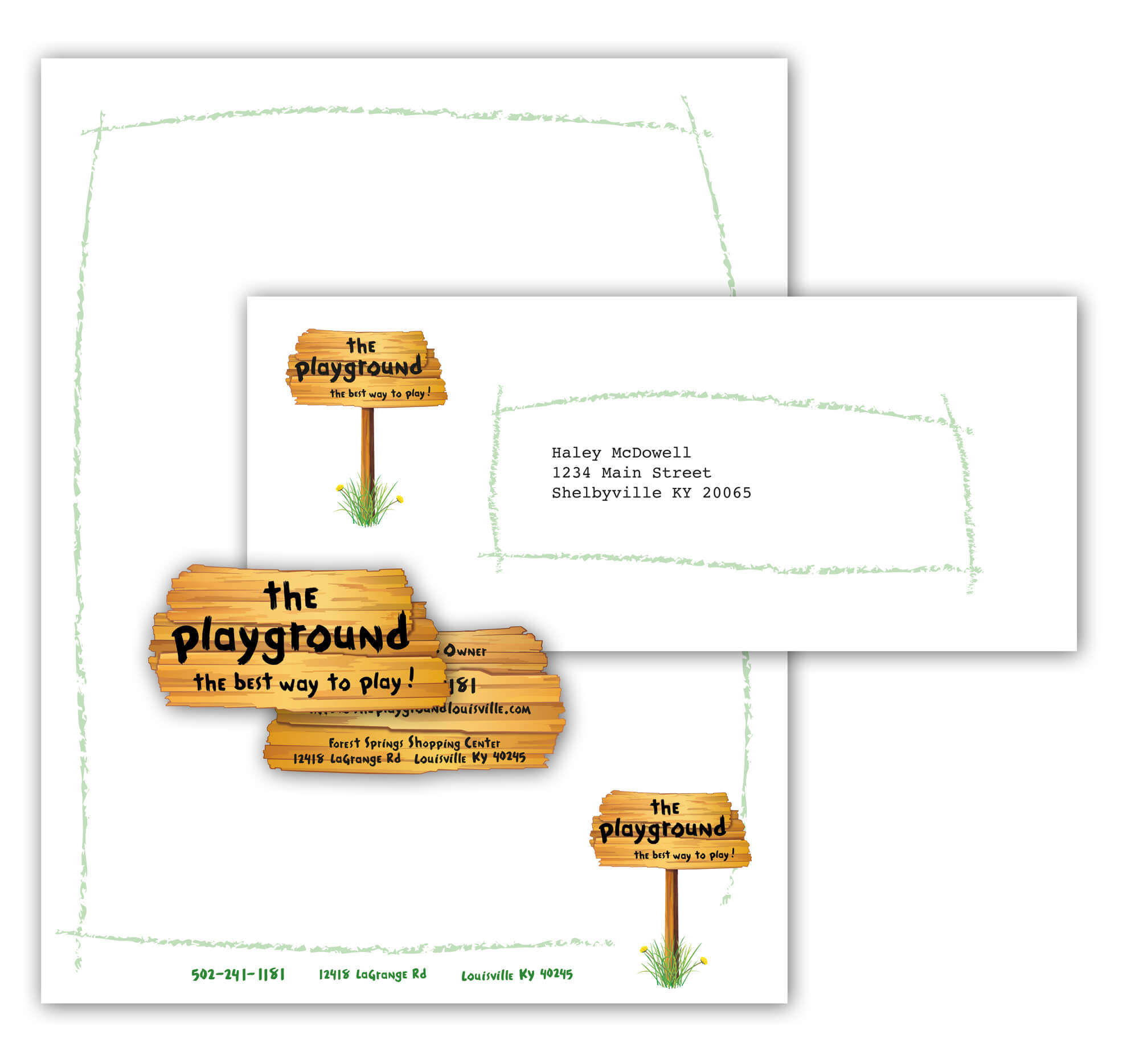
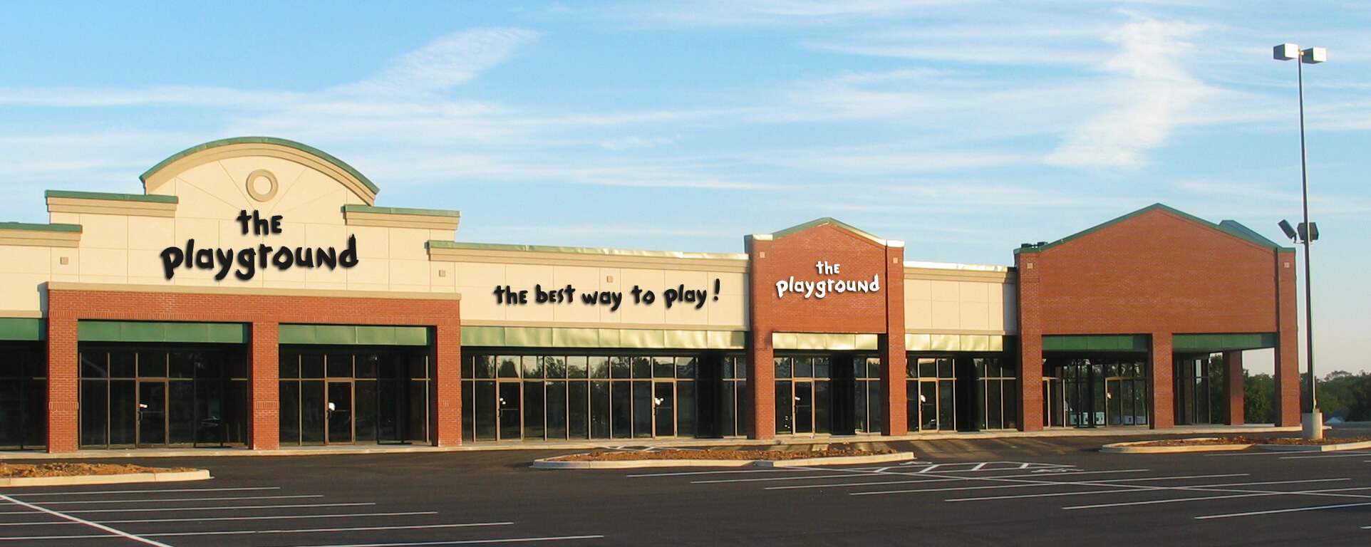
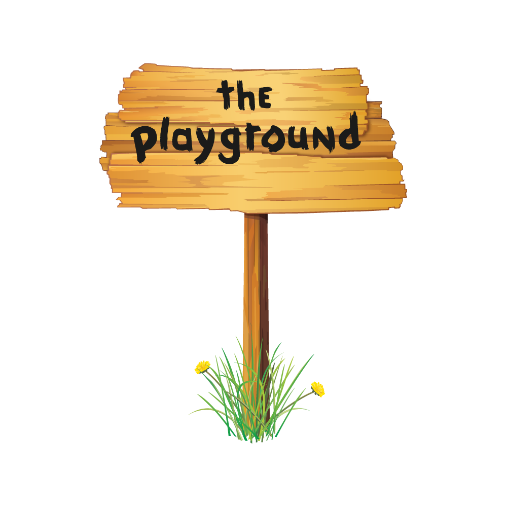
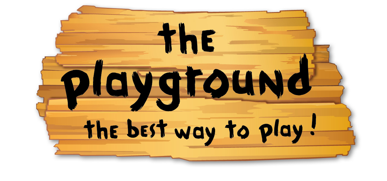
The logo represents the sign that neighborhood kids would make to proudly mark their territory, with planks of wood hammered into a post and their best possible second-grade handwriting. All informational areas of the brand are created and separated by a green crayon frame — rough, uneven, and irregular. Perfectly unsophisticated. The business cards were die-cut images of the sign and a complete departure from any others in that market.
The identity was an immediate success, and communicated exactly what the client wanted: a sense of childlike, but not childish.
“Summa Creative did an incredible job creating a brand and an identity for us. From the business cards to the outdoor signage they made us stand out in a very crowded market. The competitive edge that they gave us was significant.”
Troy Svoboda
Owner, The Playground