Eric Batterton is a dentist in a small college town who was moving offices and wanted to take the opportunity to rebrand and revitalize the company.
If you ask anyone in Delaware, Ohio about Eric the dentist, you will hear the words professional, friendly, and easygoing again and again. So, when he moved his dental practice to a new, more spacious and updated location, he didn’t feel as though his old impersonal logo and brand identity reflected the business he had grown. The value that he placed on community and local involvement, and the emphasis on long-term care and relationships needed to be evident from the time you walked in the door.
Summa Creative was asked to develop a logo that immediately conveyed the characteristics of everyone in the office: responsible, approachable, relaxed, and comfortable. In our conversations with Dr. Batterton, we realized that this is a town where everyone knows everyone else’s name, and you say hello on the street when you pass. You aren’t going to find an espresso bar, gaming systems, or Botox options in his office. Simple, professional, friendly service was valued.
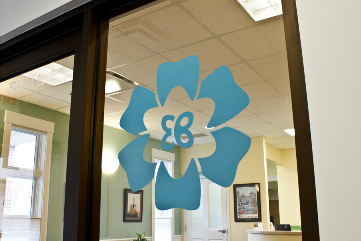
With that insight influencing our design, we looked to the abstract build of a flower, whose center holds a star, and inside that, a stamen (or is that a butterfly?). Scrutinizing the flower further, the petals have been created by outlines of teeth, the star looks much like a shield that you would carry for protection, and the stamen or butterfly is actually the initials EB, standing for Eric Batterton, who is at the center the creation. The color build is a soft, inviting blue; the very color of tranquility.